
01 — the art
Buildings are art.
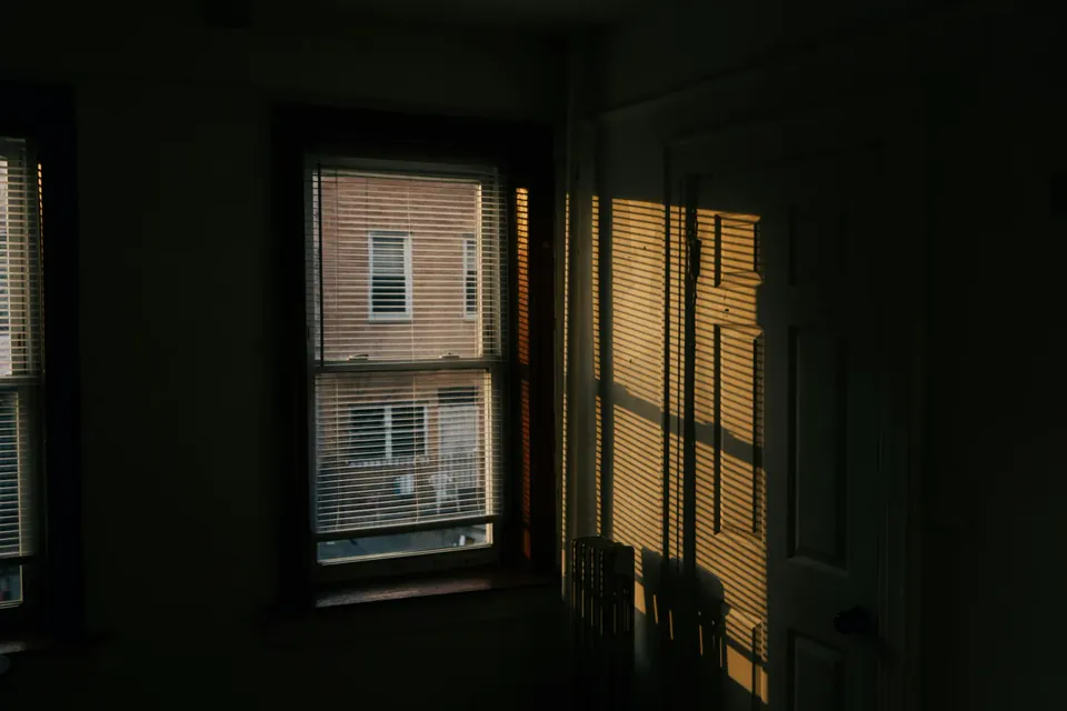
They're why New York is New York — the brownstones in Brooklyn, the prewar lobbies on Park Avenue, the cast-iron on Greene Street. Somebody designed every one of them.
descend —
A Queens studio for the NYC residential teams whose work earns more attention than their websites give it.
apply for a founding spot
They're why New York is New York — the brownstones in Brooklyn, the prewar lobbies on Park Avenue, the cast-iron on Greene Street. Somebody designed every one of them.

A $4.2M listing. The art in the blueprint — handed to a template.

The website your work has been waiting for.
— from the studio, in AstoriaDesigned for the kind of team that works at
Your brokerage gave you a page. It isn't yours. This is what yours should be.
A positioning site that says — in one screen — why this team and not the eight others they're shortlisting.

CMS-backed listing pages with the type, photography rules and rhythm of a magazine — not a spreadsheet.

A wordmark, type system and photography direction that work the day a new agent joins and the day someone leaves.
Real scarcity from real capacity — I build one site at a time. The ladder below is the whole pricing conversation. After spot #5, the price settles at $12,500 retail.
10 form fills or registered IDX users within 90 days of launch. If you don't hit it, I work free for 30 more days optimizing copy, SEO, and conversion. If we still haven't moved the number after that, I refund 50% of the project fee. You keep the site.
Within 30 days of launch, ask for your money back for any reason. Minus the IDX vendor pass-through, you get it. No conditions, no questions.
30 days from contract signing to launch. If I'm late, $250 off per day — up to 100% off the project fee. Most projects ship a day or two early.
The price you sign at today is your rate for any future redesign, refresh, or expansion — forever. The cohort five lock in their cohort rate for the lifetime of the relationship.
Performance + Satisfaction guarantees require tracking active, listings live within 48h of MLS, and the Care Plan active — all baked in by default.
The buyer feels it before reading a word. The seller feels it before signing. The agent you're recruiting feels it before her first call.
A short field guide to the nine things wrong with most NYC residential team sites — and what to do about each. Plus quarterly notes from the studio. No pitch, no spam, unsubscribe anytime.
Five founding spots. Spot #1 is free. Then the price ladder runs and the homepage becomes case studies.